Our Wines
You would spot the brand TENUTE CASINOVI anywhere. Elegance combined to a non pretentious style are the key values the company philosophy has been built on. It is very easy to recognise this brand among many others. The original company logo reminds of a whirl and it's the metaphor of growing and harvesting processes related to the seasons changes, in other words the development subject to periodicity.
A symbol full of meanings that recalls different images like the elliptic orbit of planet in our universe or a child naïf scribble. It may also recall a stylized, primitive, motherly embrace where the zealous devotion for agriculture melts with innovation.
Despite the great variety of interpretations of TENUTE CASINOVI's logo, it certainly conveys reliability and simplicity. Six tones, one per product.
Click on logos to view the wines' technical sheets
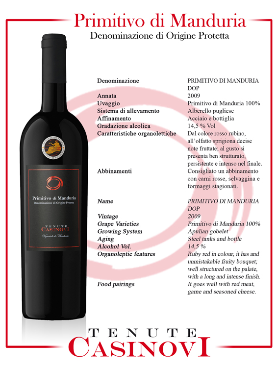 Primitivo di Manduria DOP
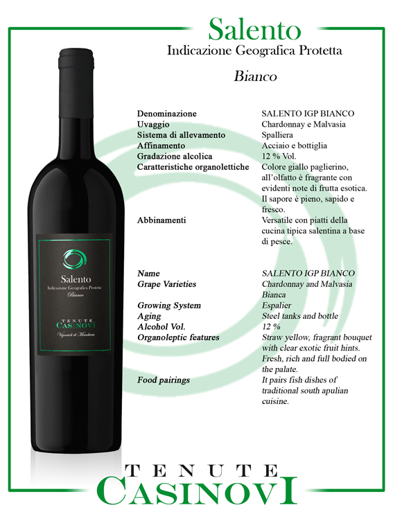 Salento IGP Bianco
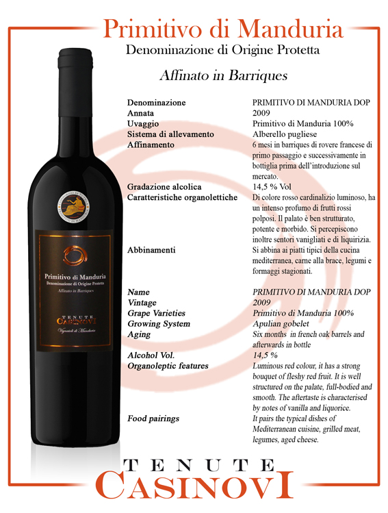 Primitivo di Manduria DOP
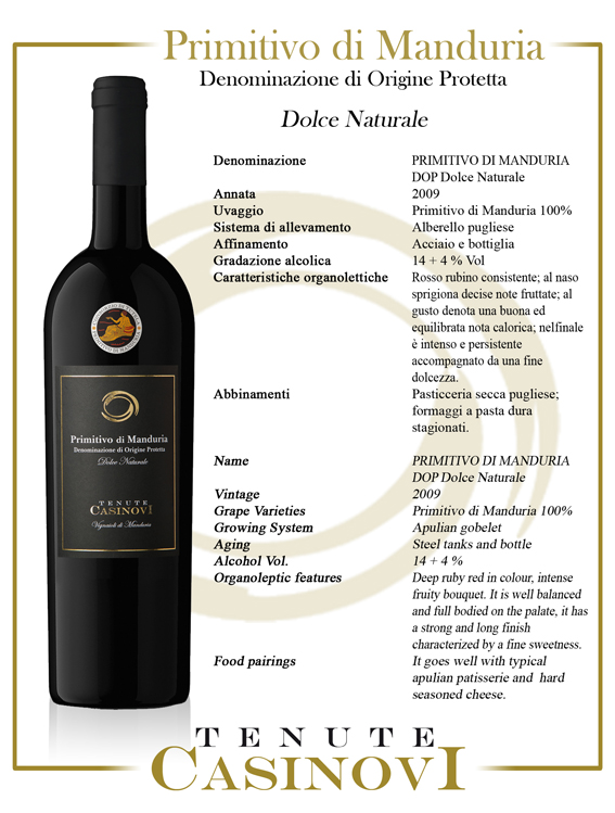 Primitivo di Manduria DOP
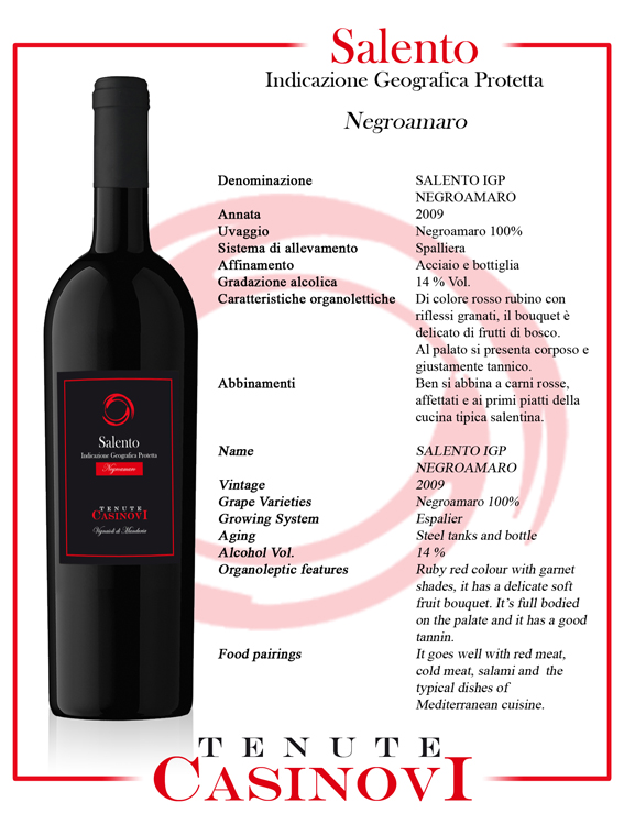 Salento IGP Negroamaro
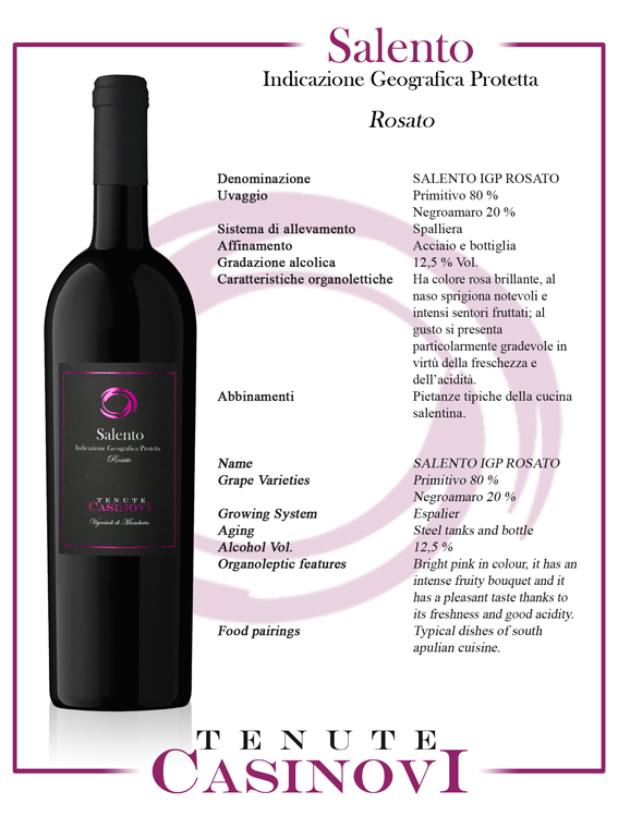 Salento IGP Rosato
 Scarica in formato PDF, tutte le schede dei vini sopra riportate.